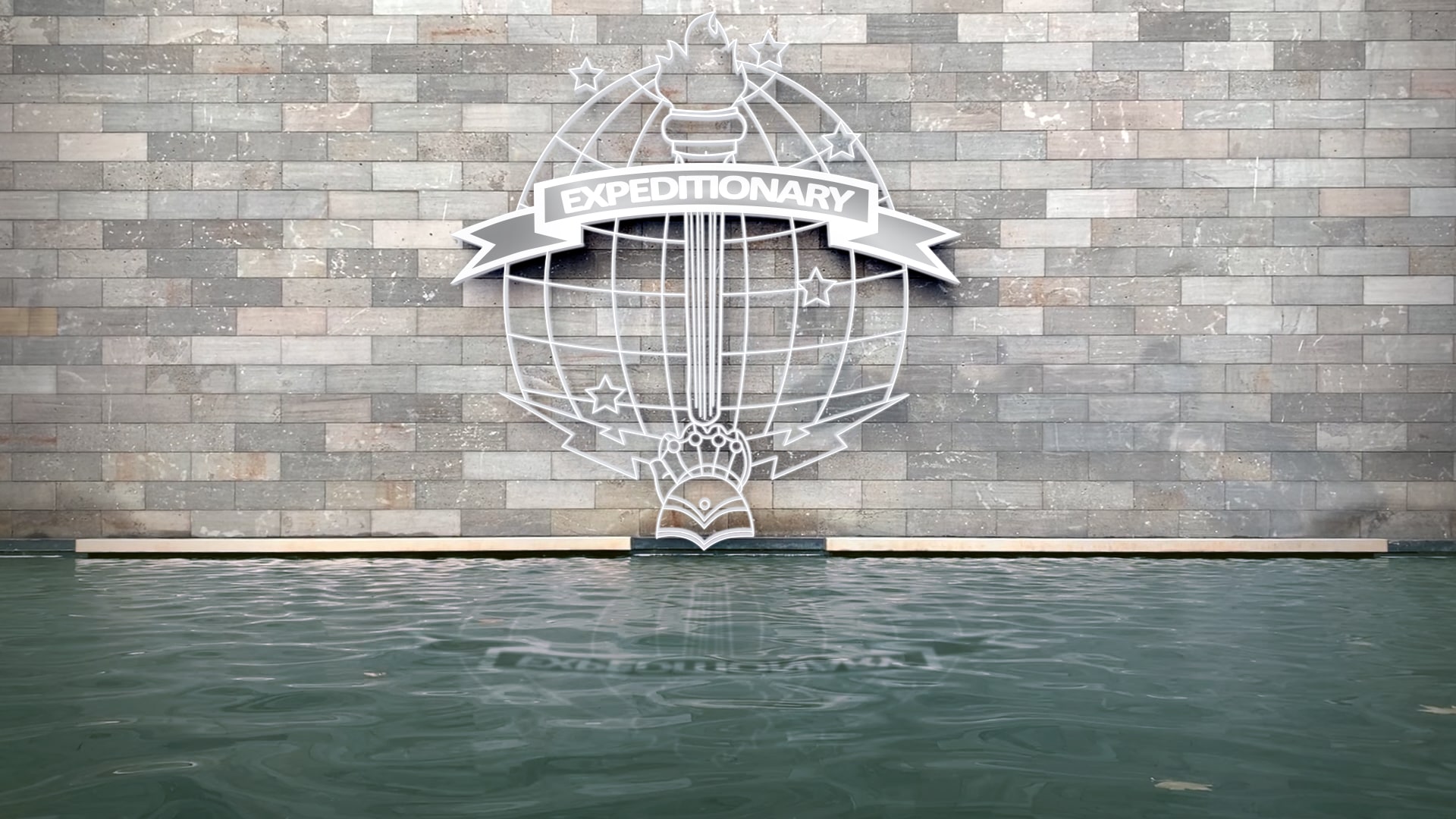
PROJECT: | The client wanted to create a logo that would represent their unit, which is made up of the most elite men within the different branches of the military (Army, Marines, Navy, and Air Force). |
---|---|
AUDIENCE: | This design is intended for a very specific audience: the military and the unit it represents. |
MY ROLE: | Designer |
Every element of this logo is specific and intentional. The gauntlet with the bolts as well as the torch are taken from the United States Army Signal Corp insignia. The stars in the background are taken from the Marine Special Operations Command. The “Expeditionary” banner across the front is from the Navy Expeditionary War pin, and the Globe background is taken from an Air Force signal unit. Together, these literal elements communicate a united group which operates together. The targeted audience is specific, as mentioned, and overall works to portray unity and diversity, with a theme of comradery and pride.
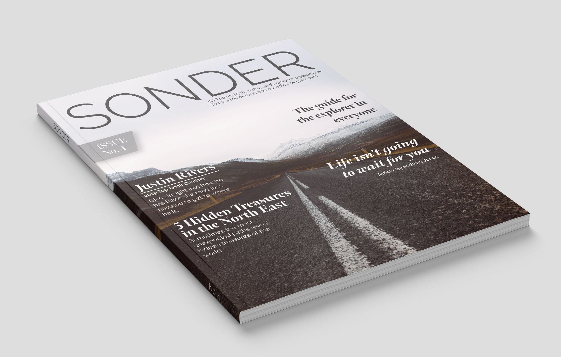
PROJECT: | The goal of for this piece was to create a balanced and enticing magazine cover for the explorer in everyone. |
---|---|
AUDIENCE: | Adults seeking Adventure |
MY ROLE: | Designer |
This is a fictional magazine however I wanted it to appear like something one
would
find on the shelves now. The design is clean, balanced, and clear on the message the magazine is
conveying. Key aspects or articles of this issue are highlighted on the cover of the magazine,
in a way that is not overwhelming and still allows the image to grab the readers attention.
Sonder is a term that means coming to the realization that every person you come in contact with
is also living a full and complete life. This is the premise behind the magazine and sets the
tone for the whole thing. Underneath the title in a very small type the definition of the word
is included. This is a unique aspect to this magazine and gives the reader an even clearer
understanding.
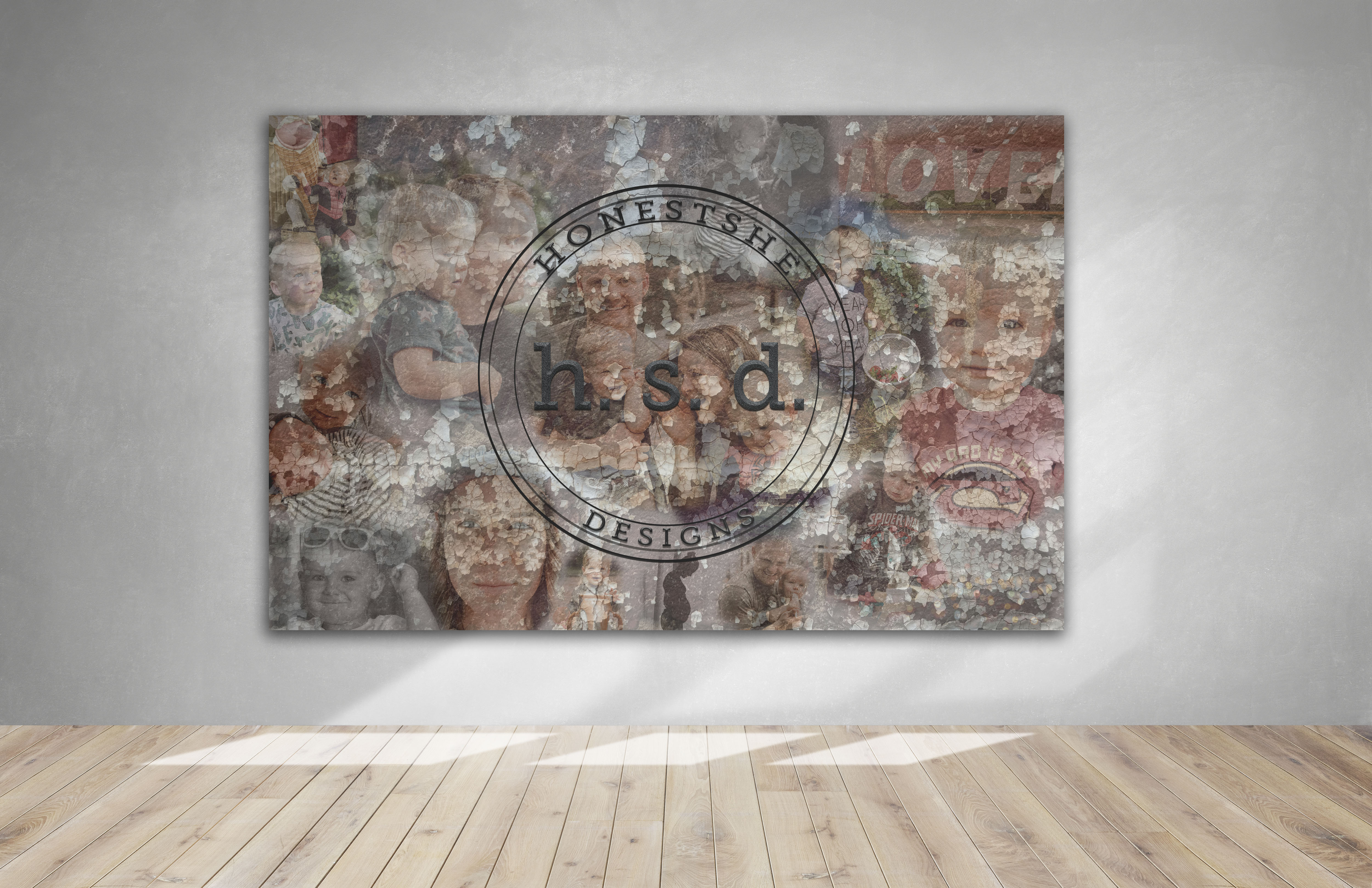
PROJECT: | To create a multilayered collage that reflects the brand. |
---|---|
AUDIENCE: | Prospective clients/ current clients/ individuals who come into the office. |
MY ROLE: | Designer, photographer |
I was the designer behind the installation and logo of HonestShe Designs
(hypothetical). This hypothetical company prides themselves on being transparent and authentic
within the world of design from what they create to how they handle business with their clients.
This installation would ideally go in the front lobby of their office and showcases the owner
and her family. The graphic is full of texture of different layers that encourage the audience
to look and observe. This design demonstrates to potential clients that the company is
transparent in who they are and what they stand for.
This piece demonstrates my ability to turn
photos into an intriguing and captivating graphic full of texture, emotion, and life. The photos
are placed with precision and purpose, the opacity of each image was brought down in varying
degrees in order to have certain images more pronounced than the others. The brick image brings
the entire graphic together and brings a ton of texture to the collage. The logo is simple which
is representative of the brand being simple, authentic, and transparent. The logo is made to
look as if it is coming off the collage behind it.
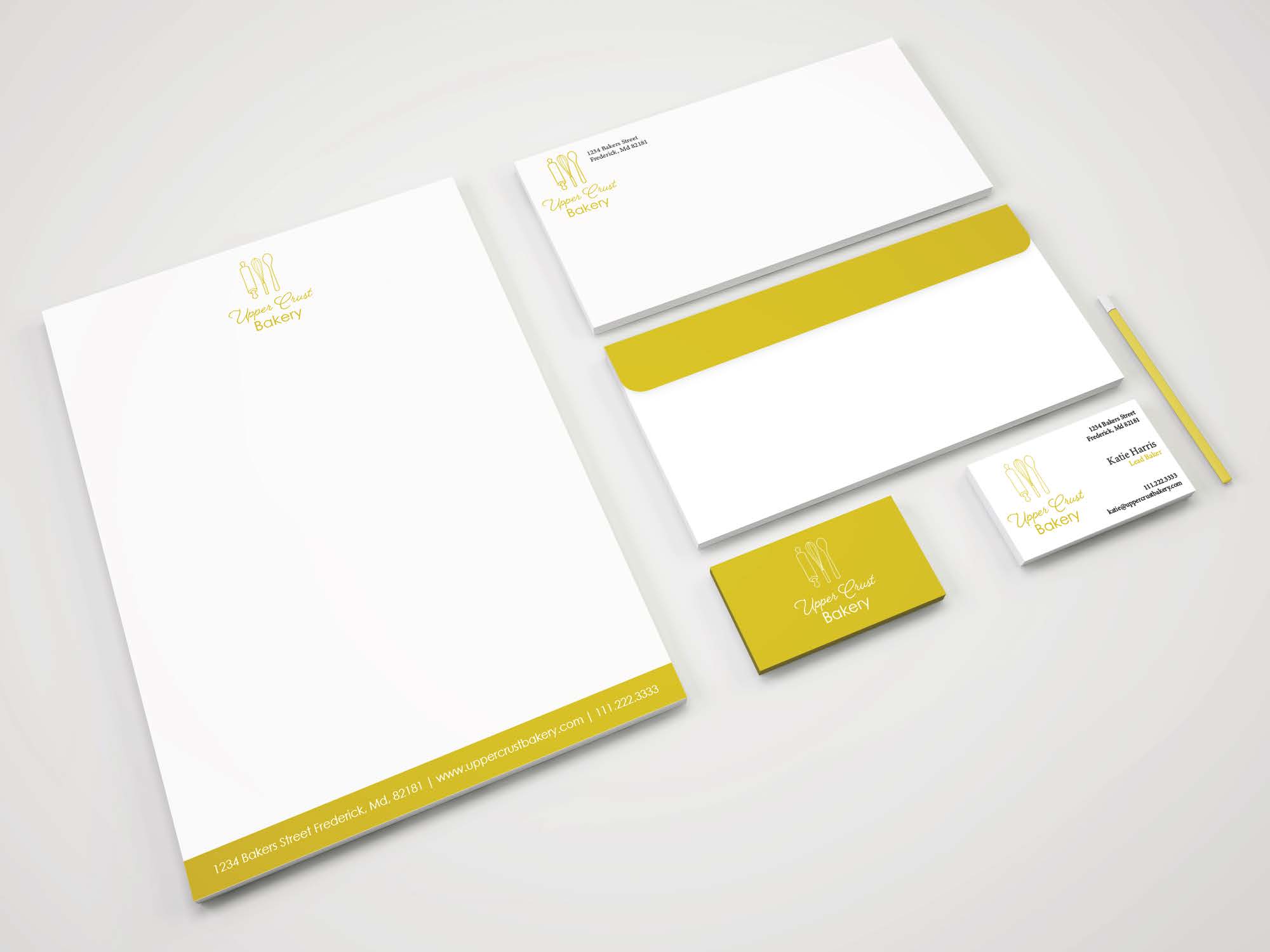
PROJECT: | The goal of this project was to help re-brand a company and design a new logo as well as new print-ready materials for them. |
---|---|
AUDIENCE: | Adults and families seeking baked goods |
MY ROLE: | Designer |
The client wanted to rebrand and stick to their roots in Europe. I wanted to create a logo that represented them as a top of the line bakery who prides themselves on baking their pastries from scratch daily. The elements within the logo are common symbols they represent baking across the world. The cursive font for “Upper Crust” is reminiscent of the Paris, France, its elegant and give the logo a higher appeal. The simple San Serif font for “Bakery” is clean and complements the cursive nicely. The color palate is simple; gold and white, the gold is again reminiscent of Paris but also make the brand feel higher end or high quality. The stationary as a whole is simple, cohesive, and effective. The target audience is wide encompassing anyone who is in need of some baked goods.
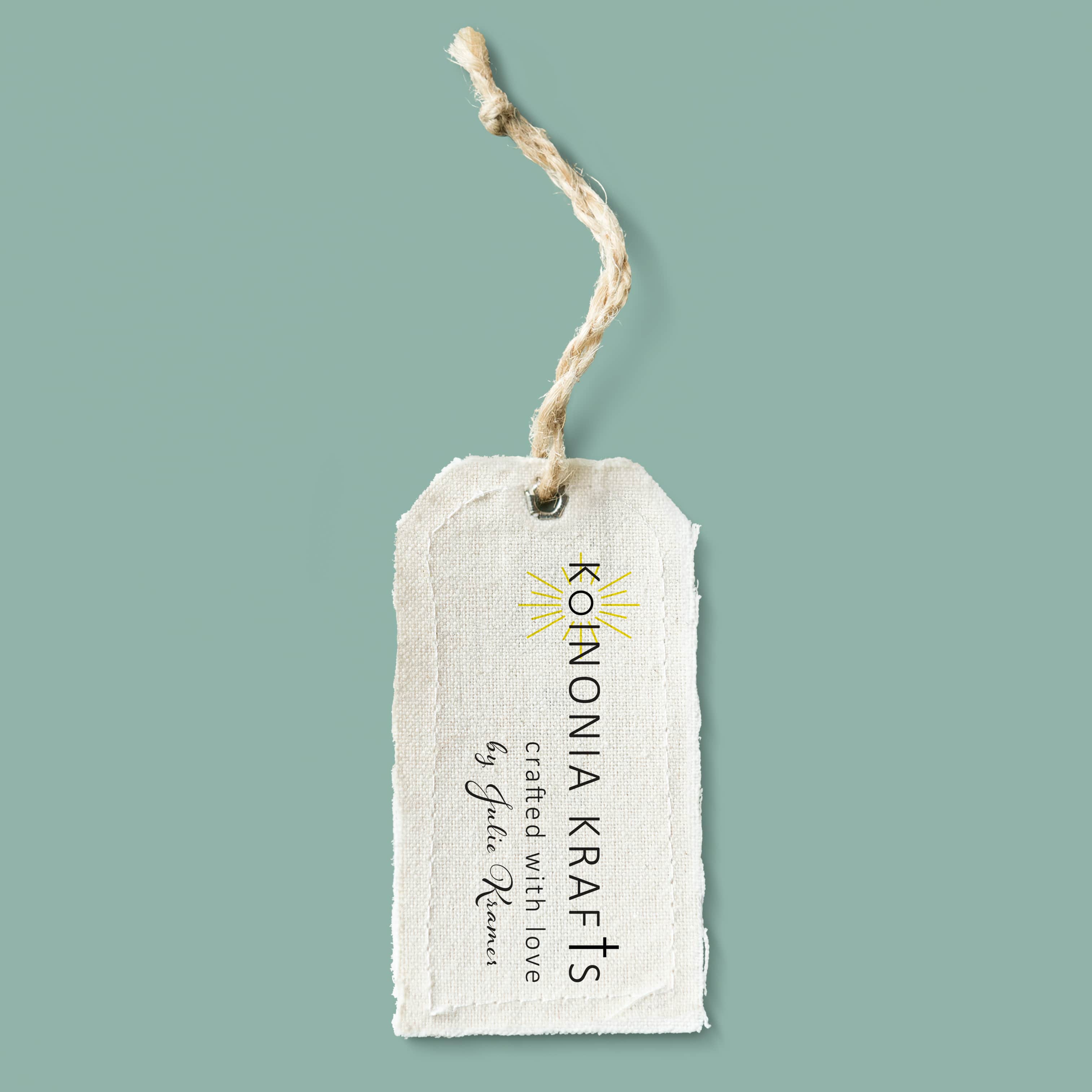
PROJECT: | The client was in need of a logo for her craft business, she wanted it to represent herself and her relationship with Christ. |
---|---|
AUDIENCE: | Adults looking for beautifully crafted home décor. |
MY ROLE: | Designer |
The client was very specific about the elements she wanted included within the logo, a sun with raise and a cross. The name of her craft shop is Koinonia Krafts the term Koinonia is used to describe Christian fellowship with fellow brother and sisters in Christ or fellowship with God. Julie’s pieces are hand made from the heart; I wanted her logo to represent that. She specializing in chalk art and quilting. I wanted the logo to look both professional but also a little fun due to the nature of what she does. By incorporating the sun and cross into the name of the logo it is playful and speaks to the nature of her brand. However, they are also sublet elements within the logo that do not take over the logo but just add to its character and overall aesthetic appeal.
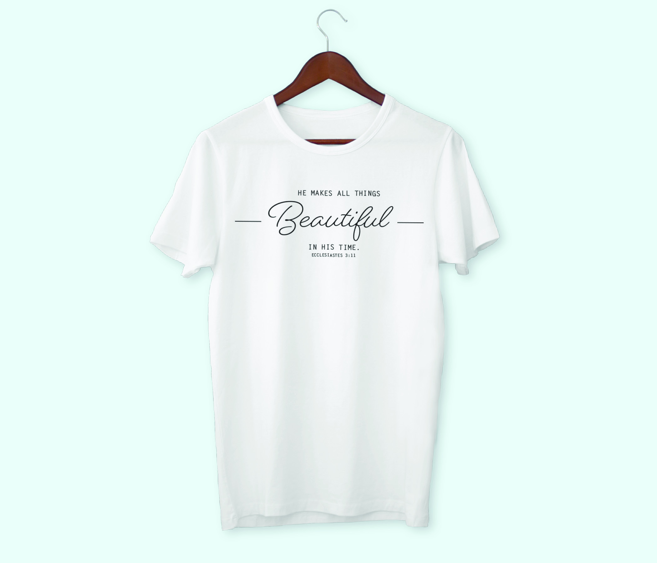
PROJECT: | The Client was in need of a t-shirt design that they would then use to sell shirts as a fundraiser for their up coming adoption. |
---|---|
AUDIENCE: | Friends and family and other supporters of the family looking to grow their family through adoption. |
MY ROLE: | Designer |
The design is simple and clean, utilizing the families verse they have been praying over for this adoption. The different styles of fonts work together to create an understated but personal statement.
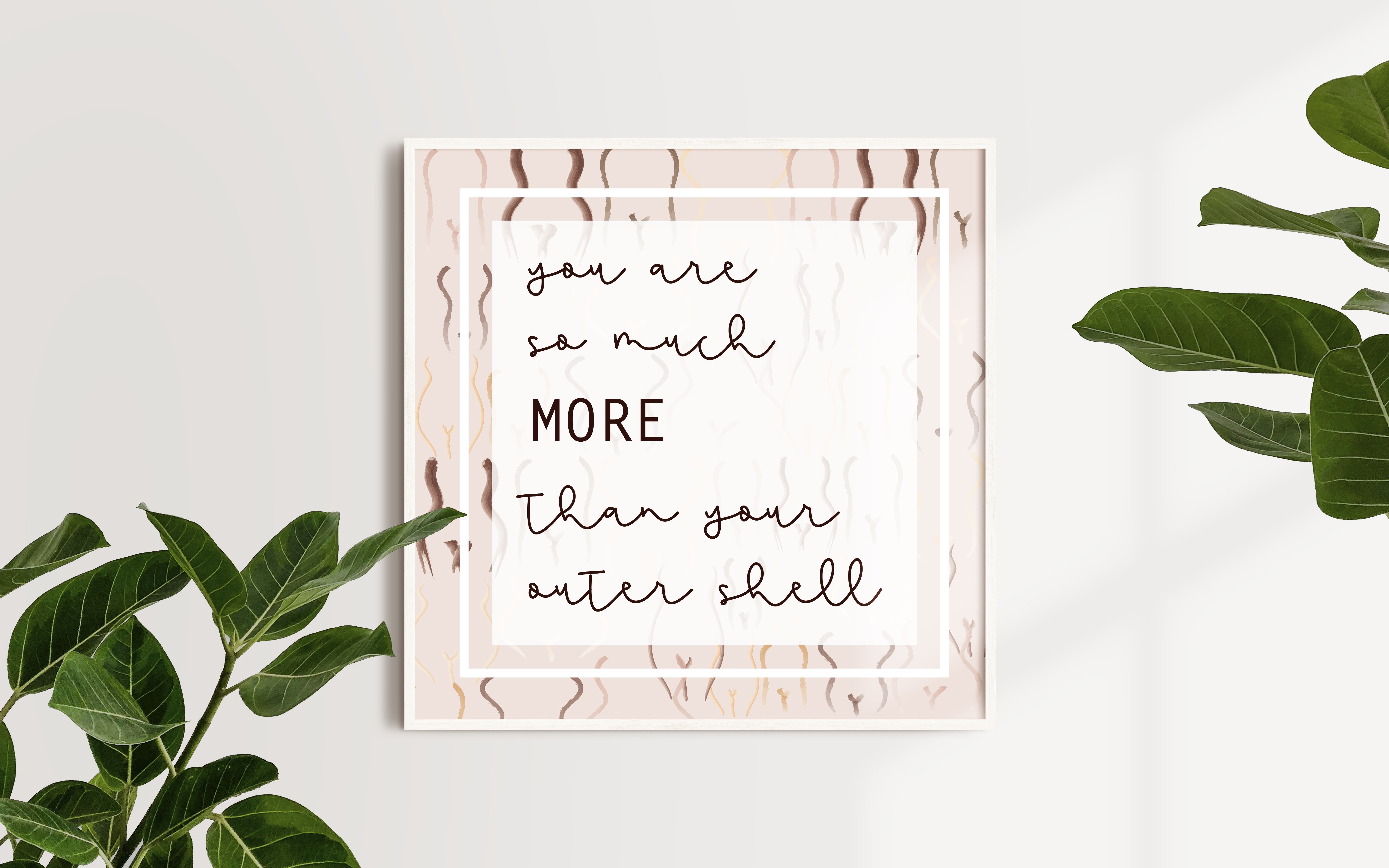
PROJECT: | This is the first poster of a campaign I am creating geared toward empowering women to recognized their true value in this world. |
---|---|
AUDIENCE: | Even though this poster is more towards the woman form I hope it can reach everyone. However this campaign is geared toward teens and women |
MY ROLE: | Designer |
This is the start of a personal project/ campaign. I have a passion for encouraging others to recognize their value in worth in this world.. It is going to be a series of posters that are meant to empower women. This specific poster empowering women to recognize that they are more than their bodies. I sketched some simple silhouettes of women’s figures all different shapes and sizes and differing skin colors. I wanted to include every woman so that she could find “herself” in there. Background represents the shell; it’s simply a shell and we, including men are more than our bodies. We bring so much more to this world than our appearance or physical space. We are intelligent, witty, hardworking, caring, loving, compassionate, talented people who deserve to be heard. The sketch lays the foundation for the text on top. I wanted it to read like a best friend is writing to you, however I also wanted to emphasis the word “MORE” as it is a part of the overall campaign but also provides emphasis within this message, they are more than their bodies.
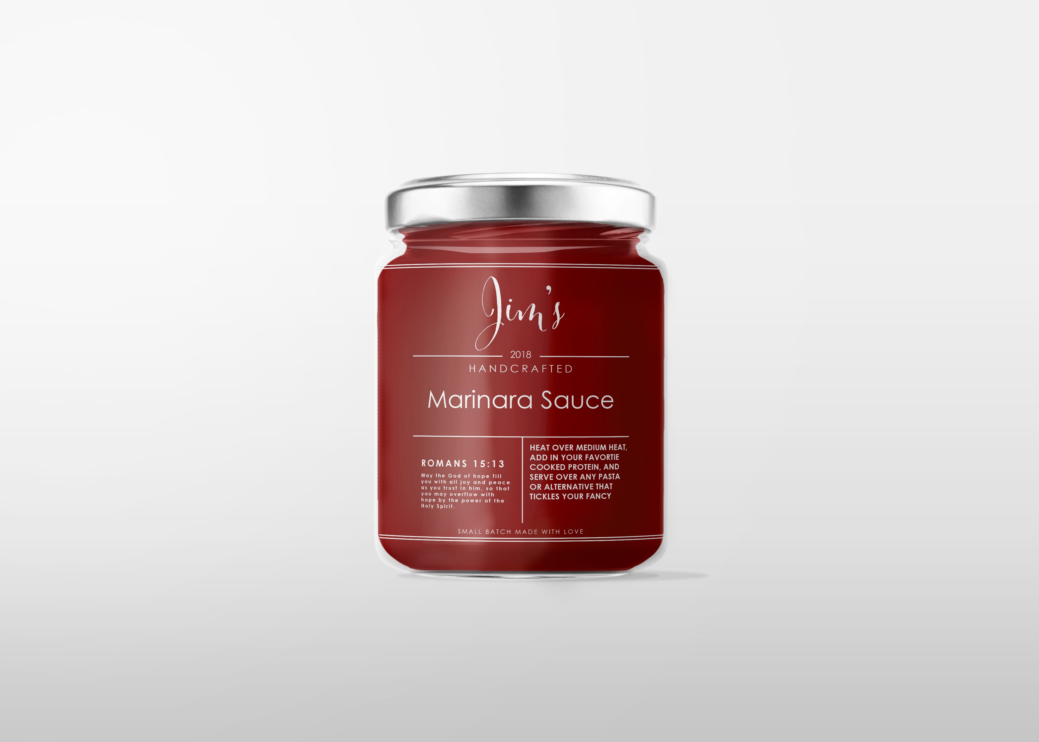
PROJECT: | The purpose of this Label is more personal than most as this label is for small batch sauce the client makes at Christmas time to distribute to friends and family. |
---|---|
AUDIENCE: | The target audience is a small group of friends and family, middle age and older. |
MY ROLE: | Designer |
The purpose of this label is a little different than most. As the client makes small batch marinara sauce that he cans and disturbs as gifts to his friends and family usually during the holiday season. As a result of this being design being used for a more personal reason (to the client), w.e included his favorite bible verse. The over all design is simple with clean sleek lines. The minimalistic approach is a reflection into the simple fresh ingredients used to make the sauce.
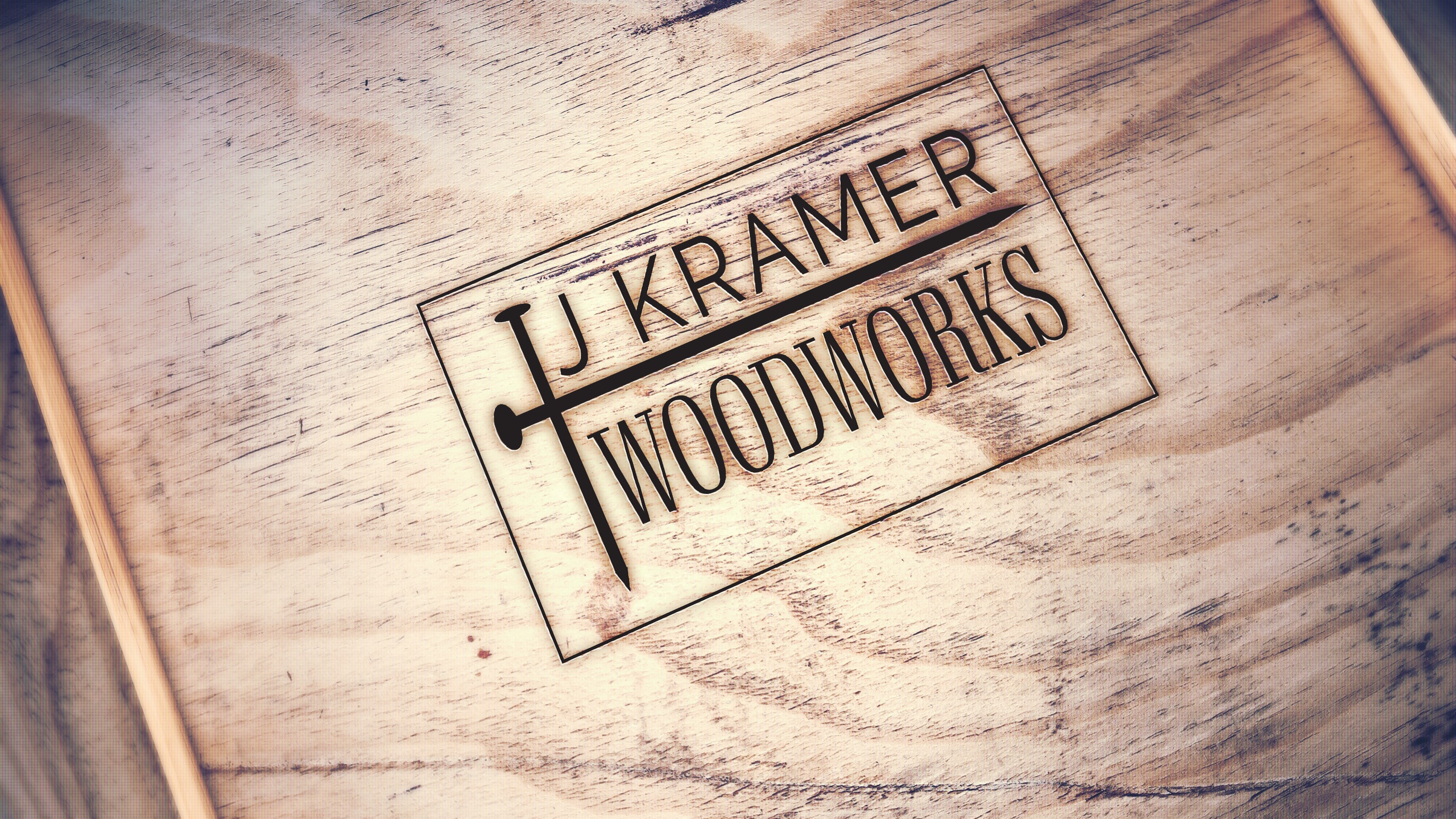
PROJECT: | The client was wanting a clean simple logo they could turn into a branding iron , so he could brand his crafted pieces. |
---|---|
AUDIENCE: | Adults interested in hand crafted furniture. |
MY ROLE: | Designer |
The client wanted a very simple and straight forward logo that would speak to him as a craftsman as well as on a personal level. Overall the design is well balanced, clear as to what it is representing to the client’s audience. The two nails cross over to create a cross which is representative of the client’s faith in God as well as ties into representing wood working.
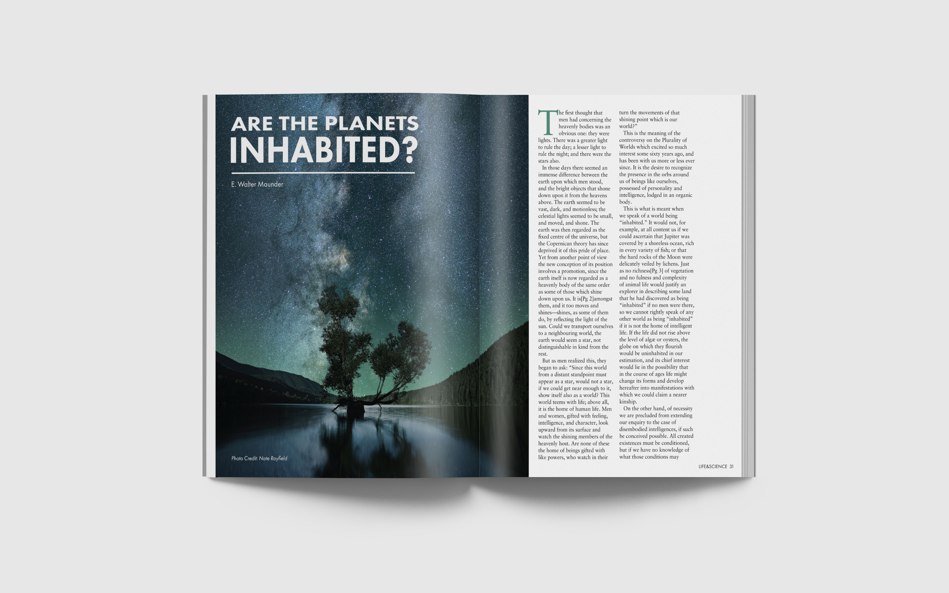
PROJECT: | The goal of this project was to design a cohesive magazine spread, that both enticed the audience but was visually balanced as well. |
---|---|
AUDIENCE: | Individuals, mainly adults' who have an interest in space. |
MY ROLE: | Designer |
This article spread is overall simple in design and balanced. I utilized a combination of san serif font and serif fonts which work together to create harmony with in the spread. Special attention to detail was held when selecting the correct kerning and leading with the copy in order to not over whelm the reader and help make the article flow easily.
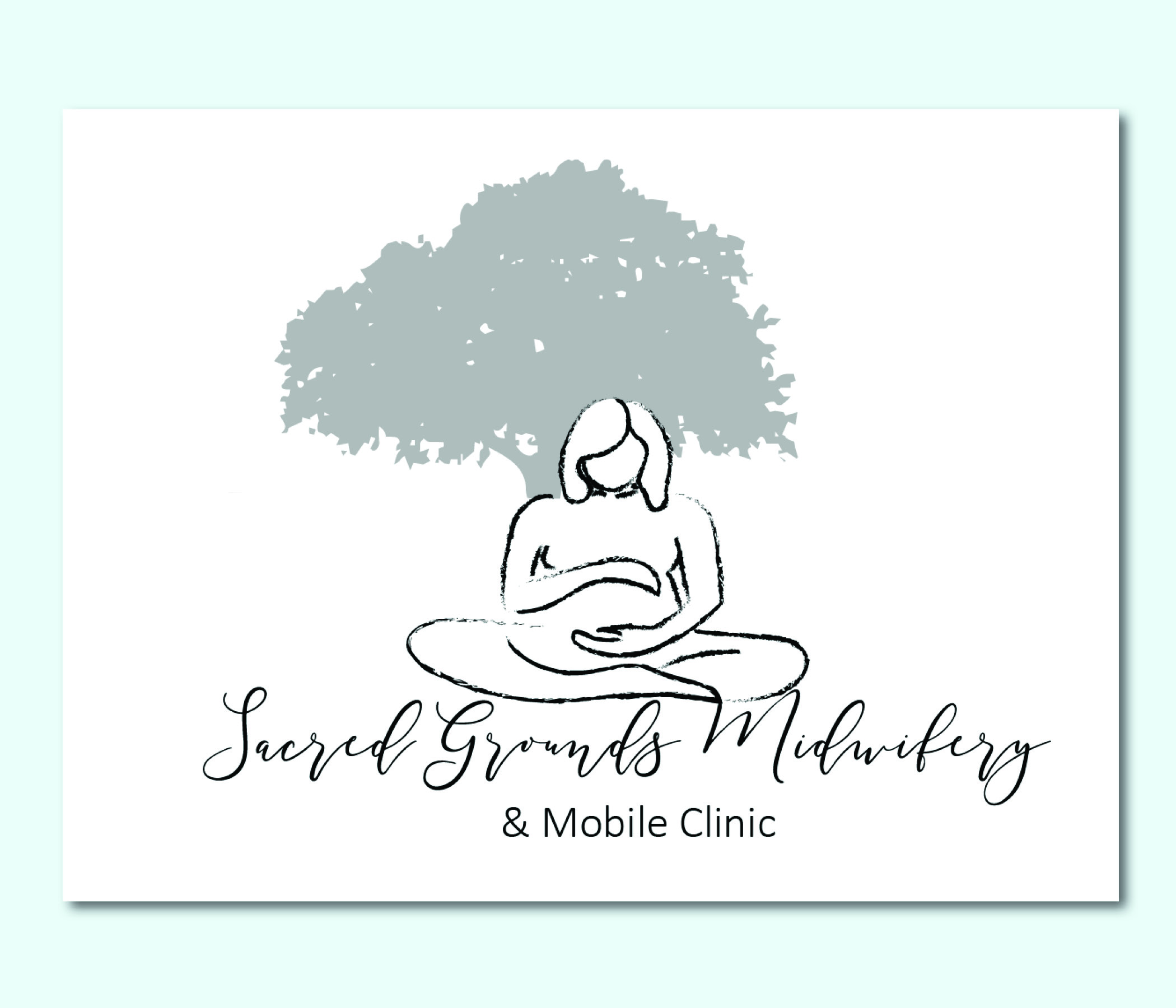
PROJECT: | The client was in need of a logo for her midwifery clinic. |
---|---|
AUDIENCE: | Her audience is to reach women in need of care for before, during and after pregnancy's. |
MY ROLE: | Designer |
The design is centered around an oak tree which is known for its wisdom and strength both of which women carry. The other component is of a pregnant women cradling her baby in her womb, even though midwives care for other issues or health concerns women face, pregnancy is a major component of their practice and thus for is high lighted in the logo. The name is scribed in an ornate script which is feminine and helps to ground the overall logo.
PROJECT: | This was a project for school, the client was in need of a new user friendly website as well as new menus. |
---|---|
AUDIENCE: | The target audience is family made up of young adults and middle age adults with kids, but this is not limiting single working class or elderly. |
MY ROLE: | Designer and programmer |
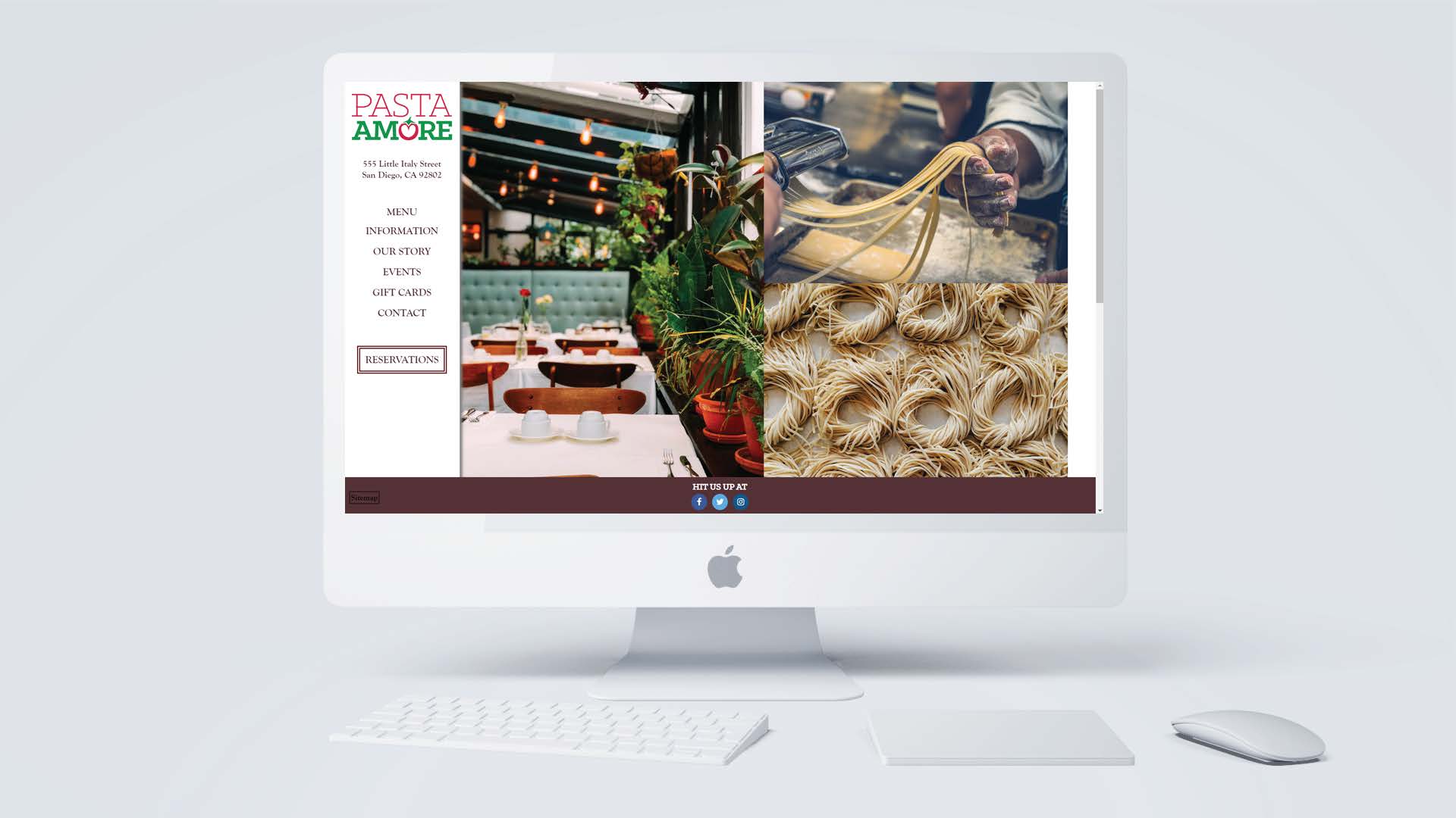
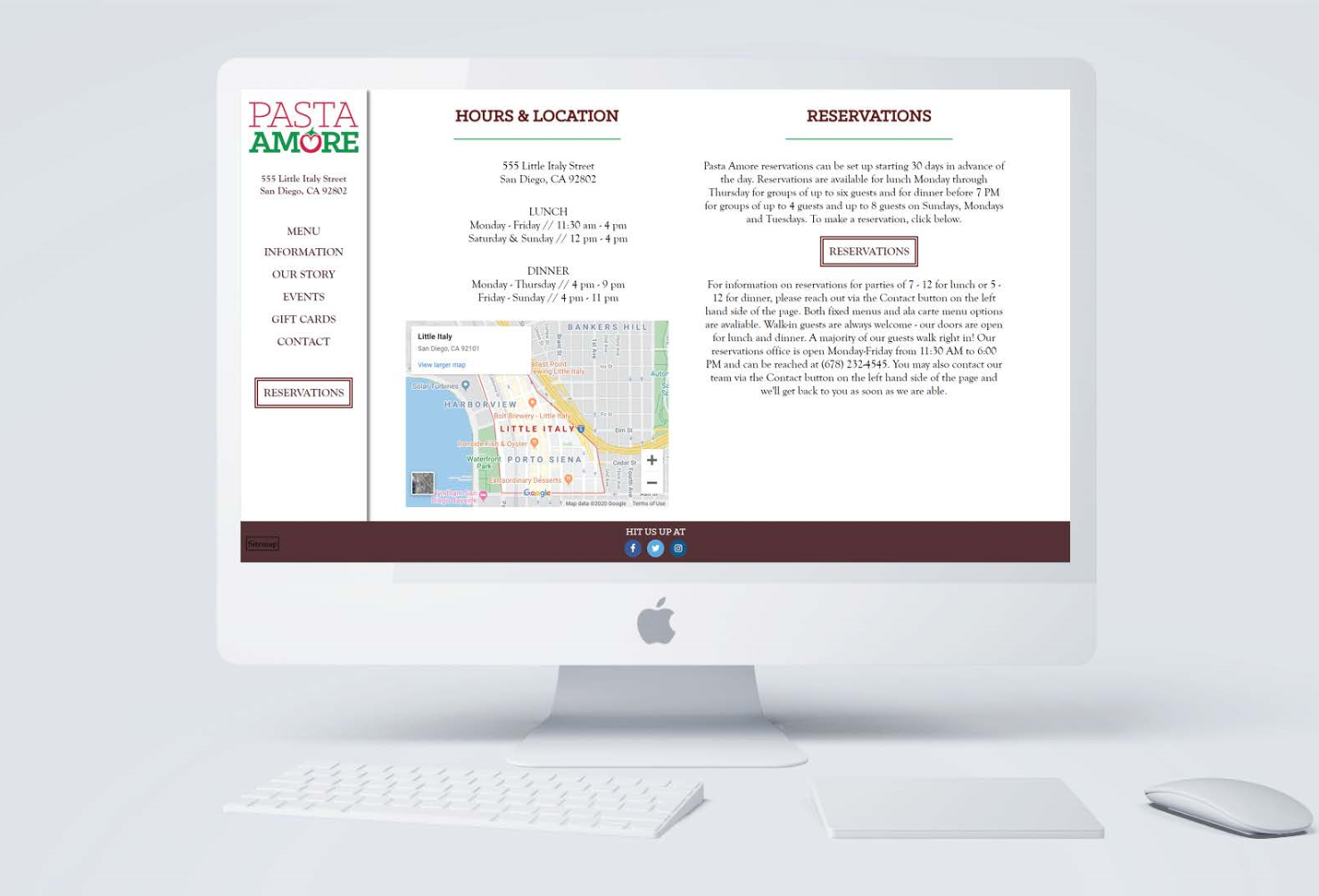
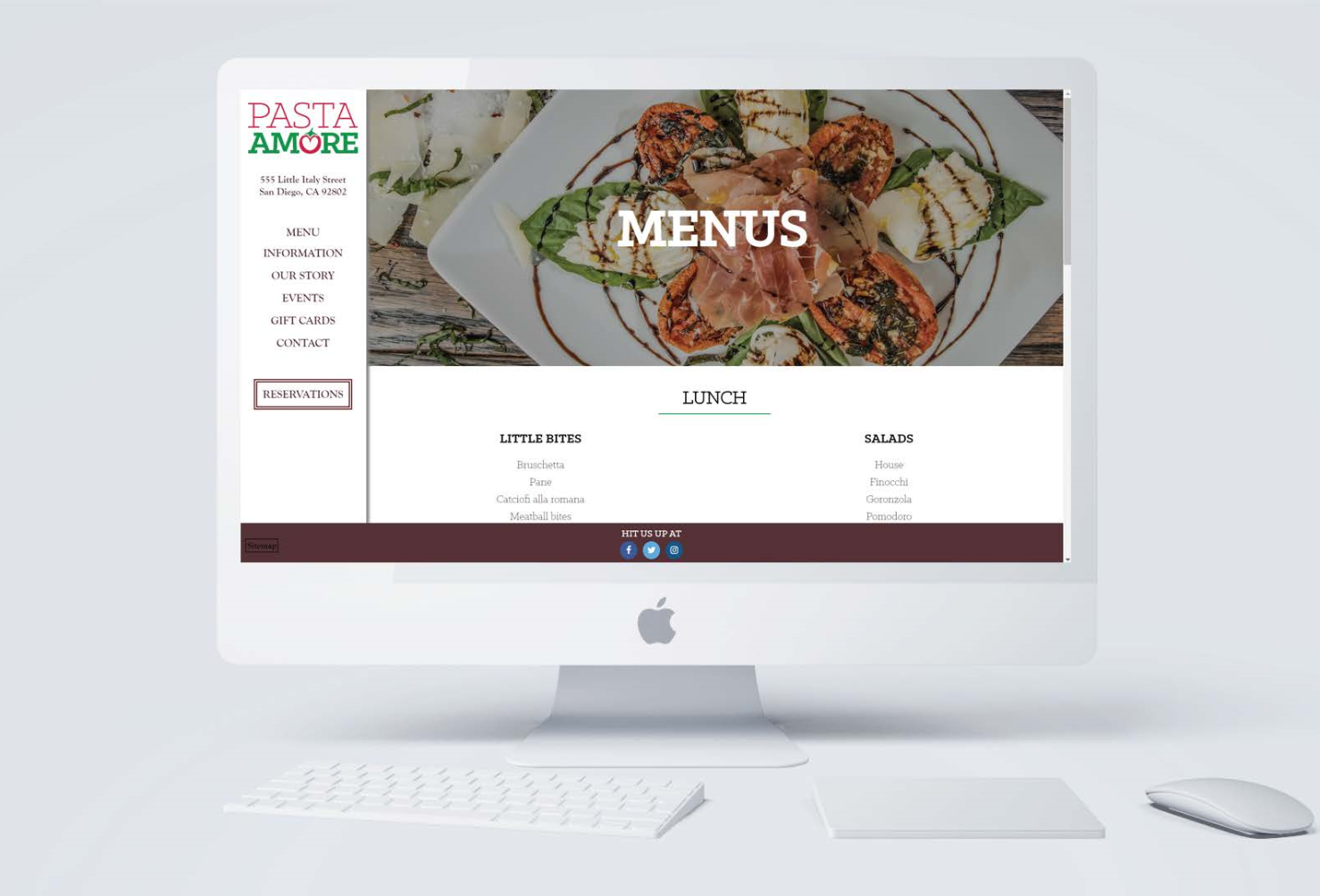
The goal of this project was to design a user-friendly website that reflects
the core values of Pasta Amore and presents to the public a clean and simple layout which
highlights all the essential information in a way that is inline with their brand. Pasta Amore
prides themselves on being a family friendly restaurant who creates authentic Italian dishes
with a twist using only the freshest of ingredients daily. From this information and taking into
account what is attracting todays customers as well as what I know to be timeless, my idea was
to create a simple website that would let images of the food and scenery from the restaurant do
the work in speaking to the quality of the dishes and atmosphere.
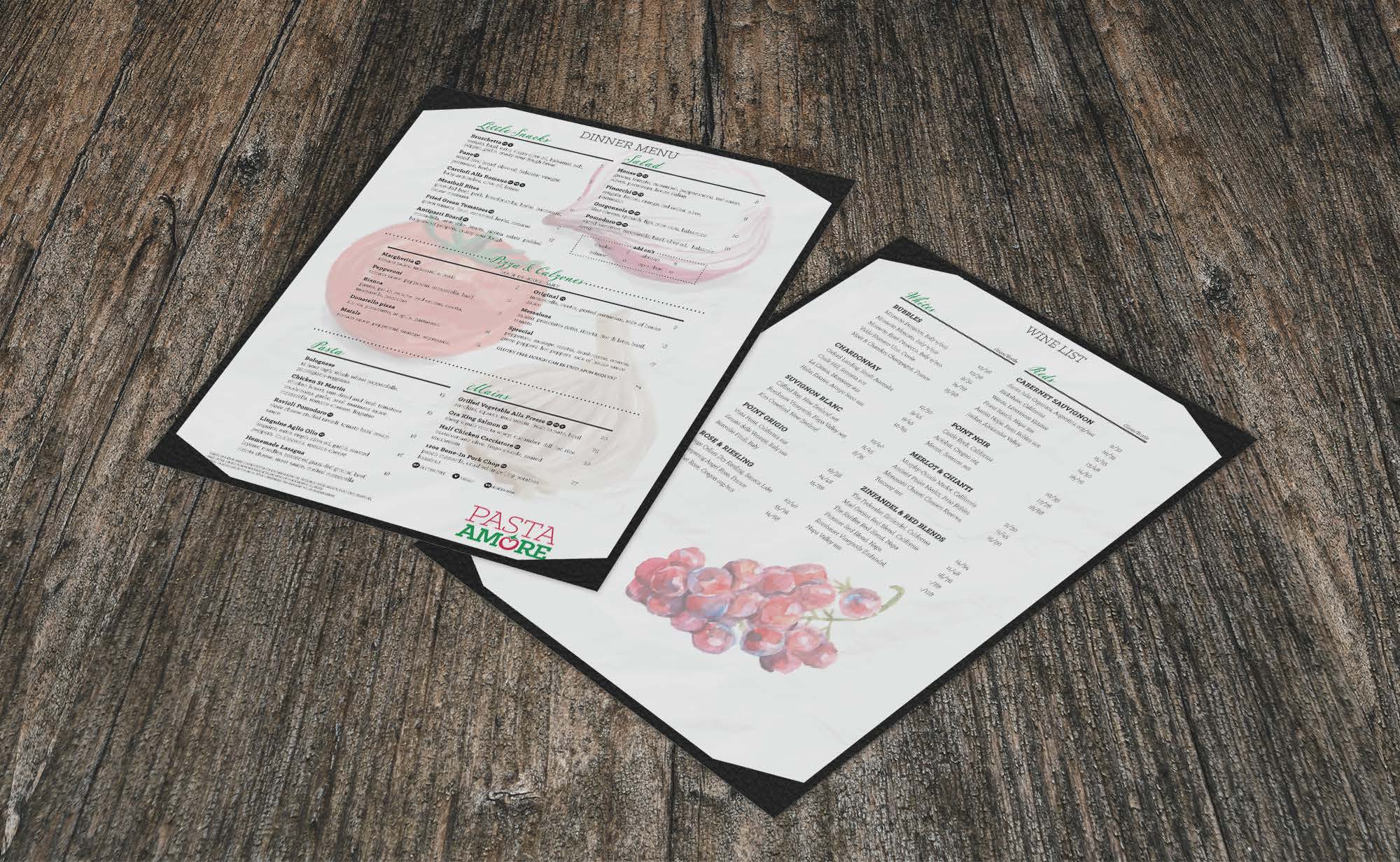
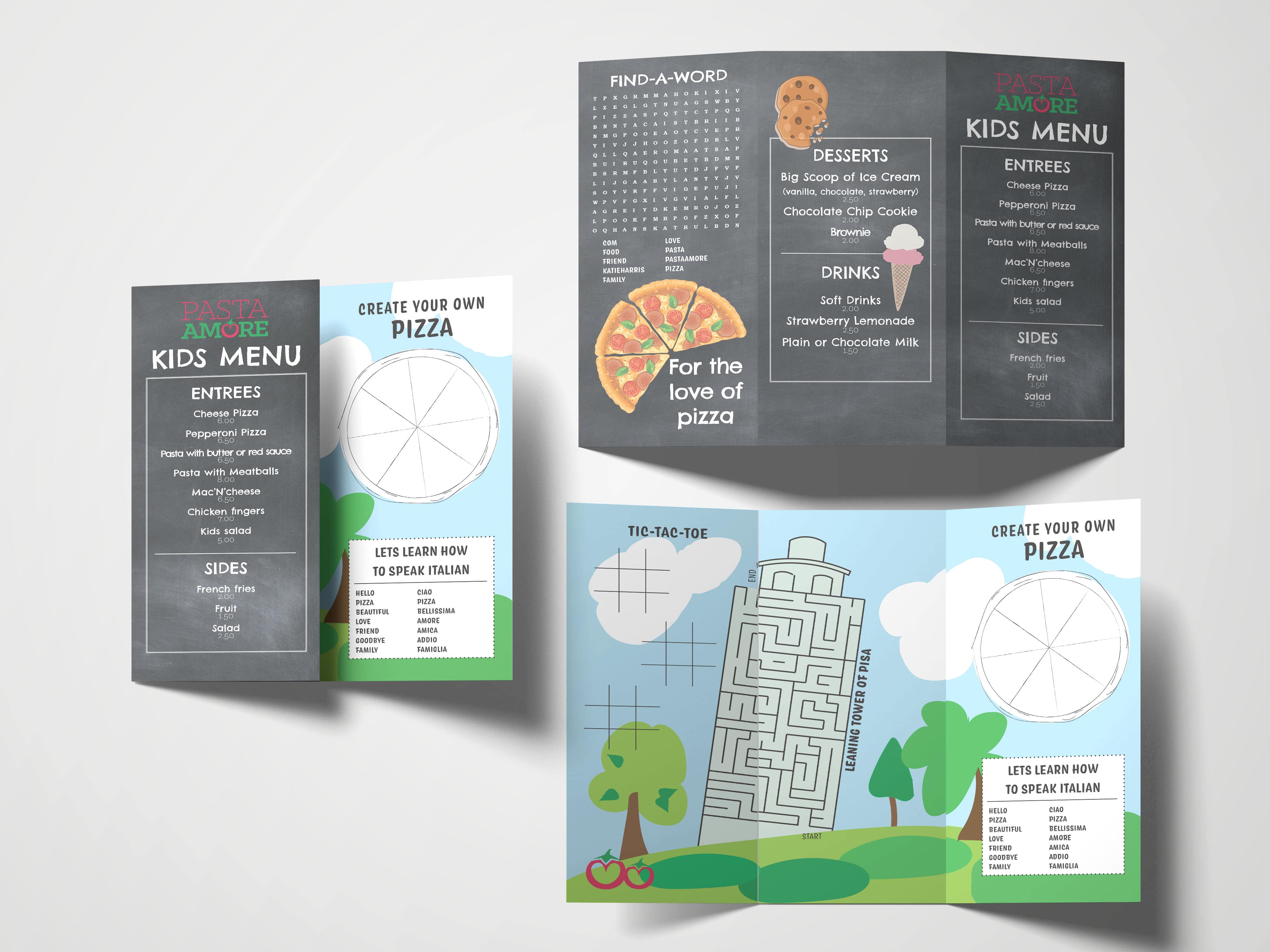
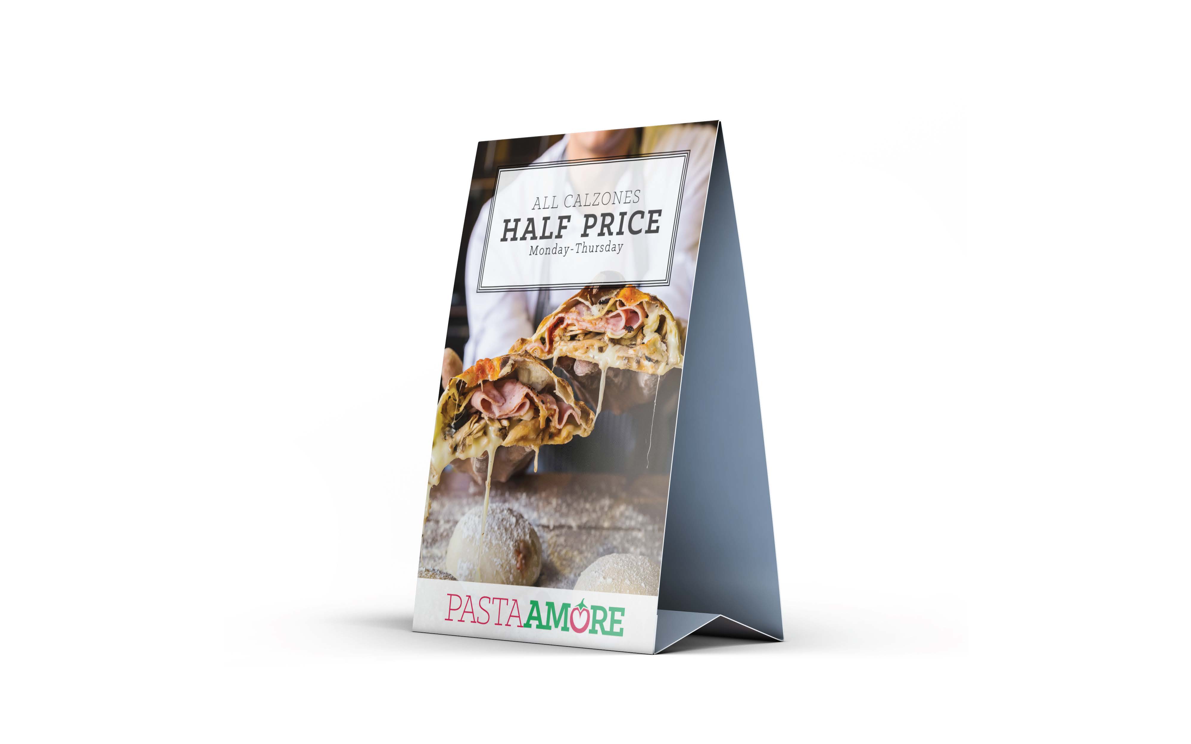
The goal of this was to create
a cohesive and curated set of print ready deliverables for Pasta Amore. They were in need of a
new menu, table tent with a weekly promotion, and a tri fold kids menu. All three items can
stand alone but also look great together. When designing these items, it was essential to take
into consideration the target audience and biases or social and cultural factors that may cause
offense to be taken. In the end I was able to design three pieces that stayed true to the Pasta
Amore brand; they are all balanced and showcase different aspects of the brand.